


Giravolte, a Casa Modena brand, is a tasty and ready-to-eat dish. It is sold in the refrigerated section in supermarkets and it easily fits in a modern, fast-paced lifestyle. It has been on the market for several years and consumers see it as an appetizing, cheerful product. Due to a lack of communication, however, sales do not live up to the brand’s full potential, especially in a growing market such as the one of ready-to-eat refrigerated dishes. Casa Modena intends to refresh the Giravolte brand and make it appealing to a younger target, both by updating the existing line and by creating a whole new line featuring a Finger Food (teenager friendly) version of Giravolte.
Giravolte
SCENARIO
THE TASK
It was necessary to refresh the brand according to its new offering and target, staying true to its key identifiers.
DESIGN SOLUTION
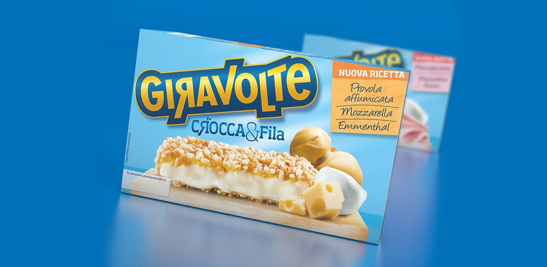
Having been on the market for many years, Giravolte has acquired the needed legitimacy to become a brand of its own. Furthermore, the new offering moves away from the more traditional positioning of Casa Modena. For this reason the mother brand endorsement was removed from the logo. The “Crocca & Fila” (crispy and stringy) descriptor was added to the traditional line of Giravolte in order to stress its pluses over competitors’ products. The reversed “R” in the descriptor was enriched with an “explosive” graphic sign to convey crispness. In the new photo the product stands out on a cutlery while the angle of the shot focuses on its crunchy coating. This, together with the representation of the ingredients, increases the overall appetizing appeal.
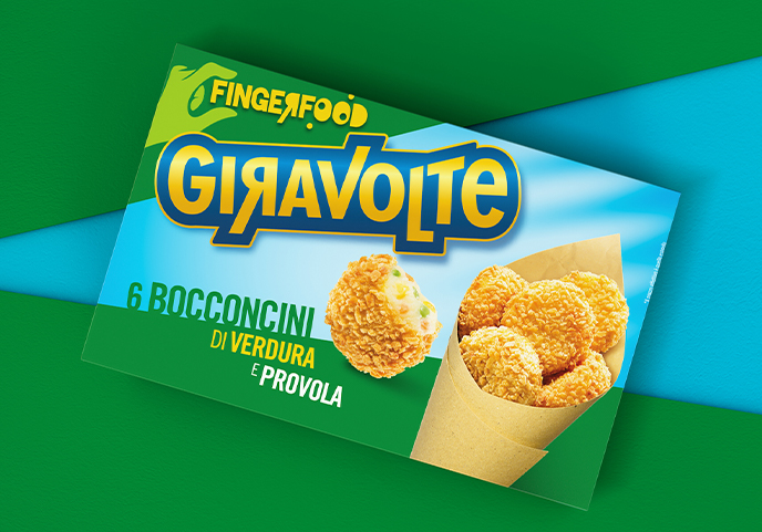
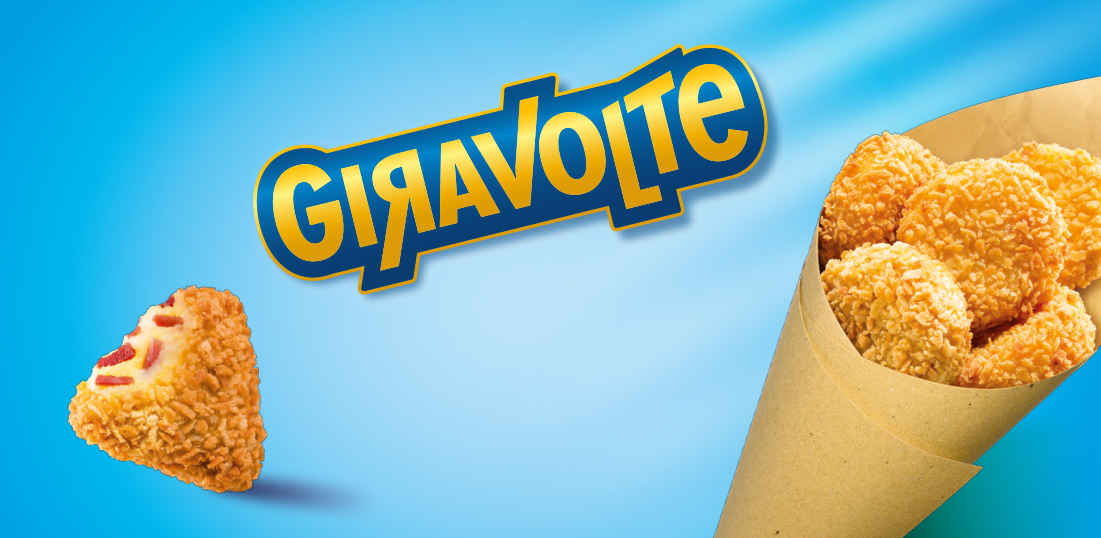
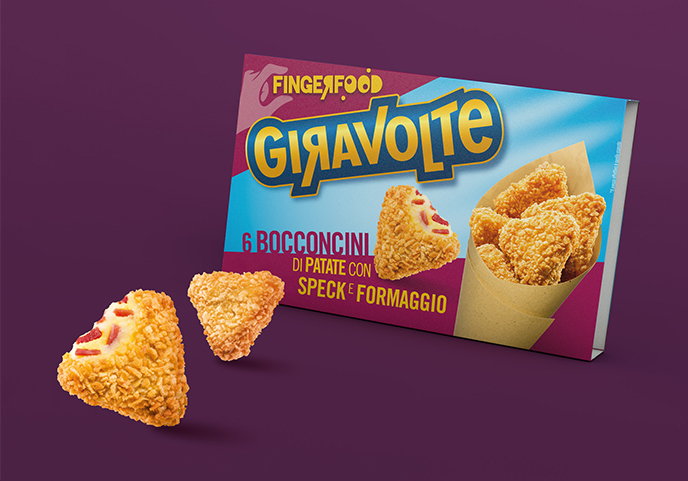
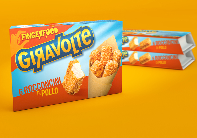
The new Finger Food line is addressing a younger target, therefore stronger colours (unusual for the segment) appear next to the traditional light blue (freshness). “Finger Food” acts as a sub brand and its reversed “R” adds a touch of playfulness. The hand holding the sub brand name together with the main visual (a paper cone) add to the on-the-go and young nature of the new Giravolte line.
La Linea Fingerfood è destinata a un pubblico più giovane, e accanto al tradizionale azzurro (il fresco del prodotto da frigo), compaiono colori forti, inusuali per il segmento. “Fingerfood” assume valenza di sub brand. La “R” girata aggiunge una dimensione moderna e giocosa, mentre la mano che sostiene la scritta, insieme al cartoccio da asporto dell’immagine principale, esalta la dimensione dinamica e “street food” delle nuove Giravolte.