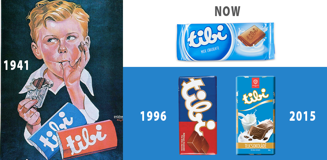
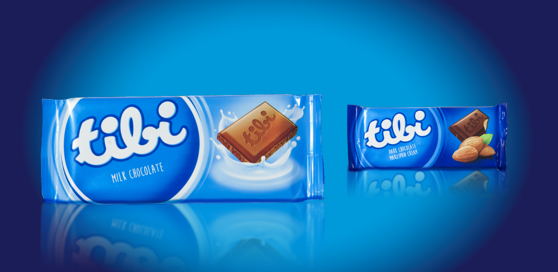
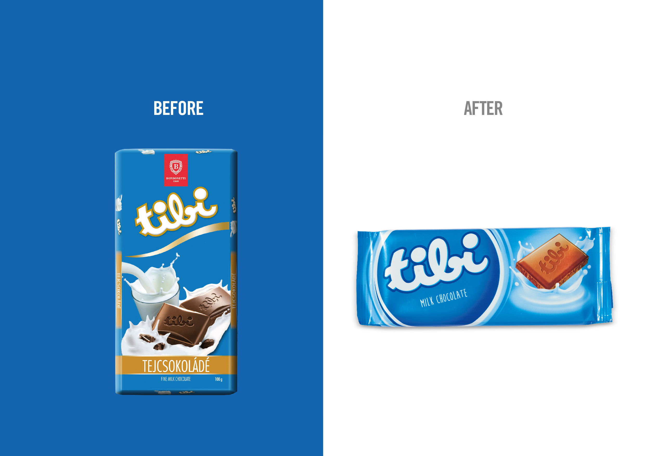
The Tibi logo remained unchanged for over 70 years, making it extremely recognizable and an exceptional brand asset. For this reason it was only softly retouched in shape and proportions, whereas its gold outline has been changed to blue, as this classic colour for Tibi packaging is the one that consumers really associate the brand with.
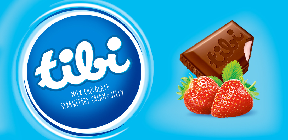
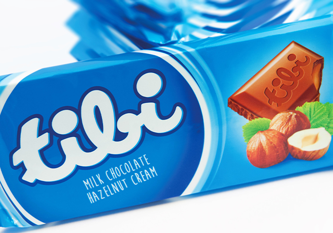
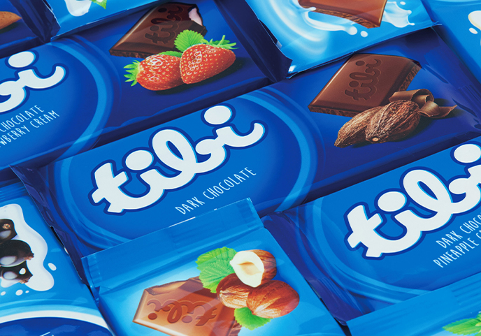
To further capitalize on the heritage of the logo, the whole new packaging system was designed around it, giving it a major role and placing it in a round seal that adds value to it. The descriptor has been placed under the logo, to let the consumer easily read it. The new horizontal layout adds modernity, and so does the new shade of blue dominating the pack. Product flavours and ingredients have been put to the fore and shown together with cut squares of chocolate that display their filling, to enhance both clarity and appetizing appeal.
