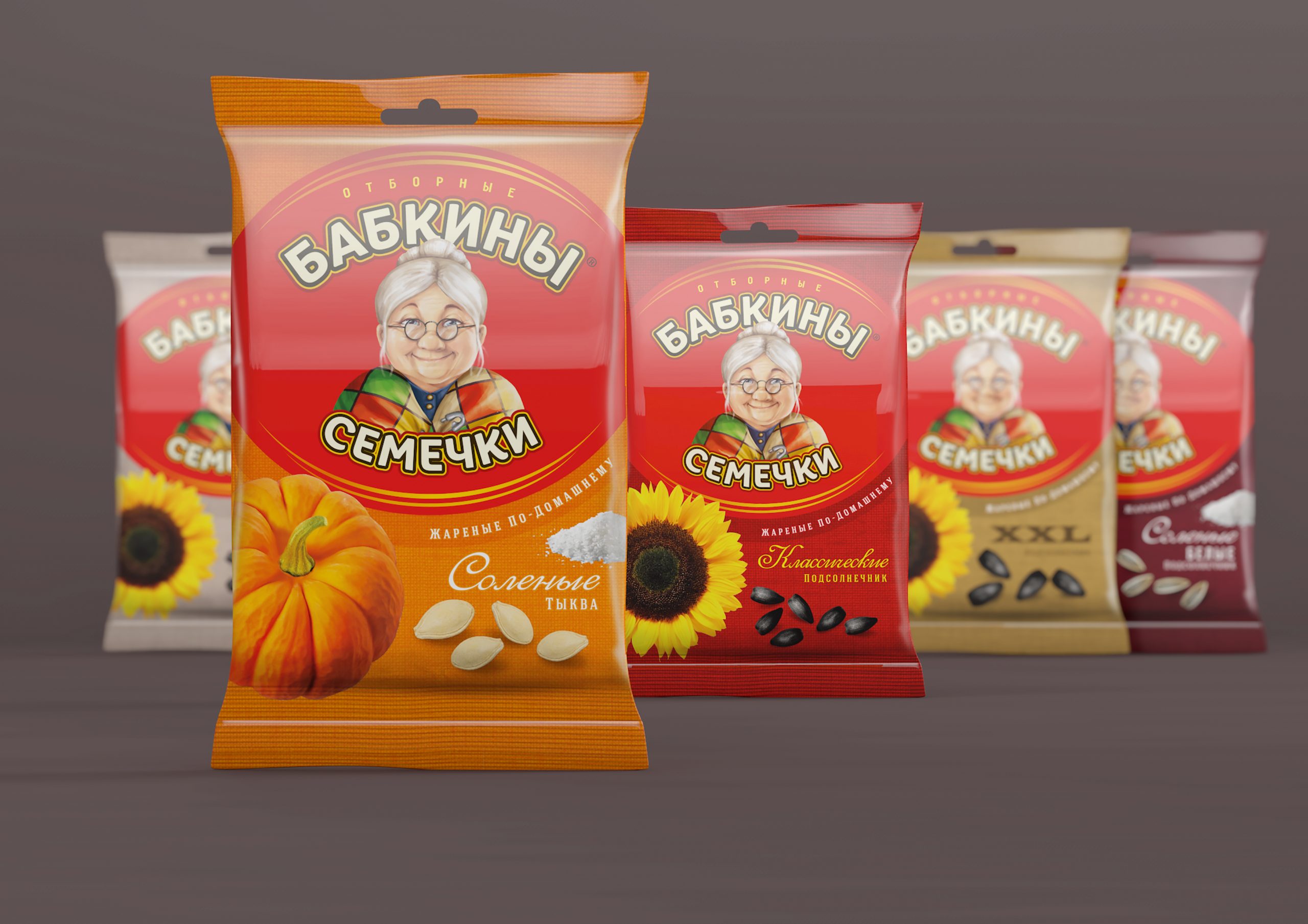


Babkini is a line of packaged sunflower and pumpkin seeds. It is a traditional Russian snack. The brand belongs to the Russian group KDV, and is one of the main players in its market. The product enjoys a very high consumer awareness thanks to a long presence on the market (over 10 years) and a very strong character on its packaging: a Russian babushka (grandmother). The target consumers are housewives who appreciate quality at a reasonable price.
Granny’s Seeds (Babkiny Semechki)
SCENARIO
THE TASK
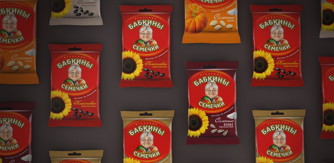
The grandmother character has definitely helped Babkini become a traditional and reassuring brand. After some years, however, it feels dusty out-dated. It is necessary to evolve the brand -not revolutionize it- and capitalize on its strong personality. Values to be conveyed are still those of tradition, naturalness and quality, but this time around it must be done with the strengths and codes of a contemporary classic brand. It is also necessary to make the whole architecture more rational and consistent across the whole line.
DESIGN SOLUTION
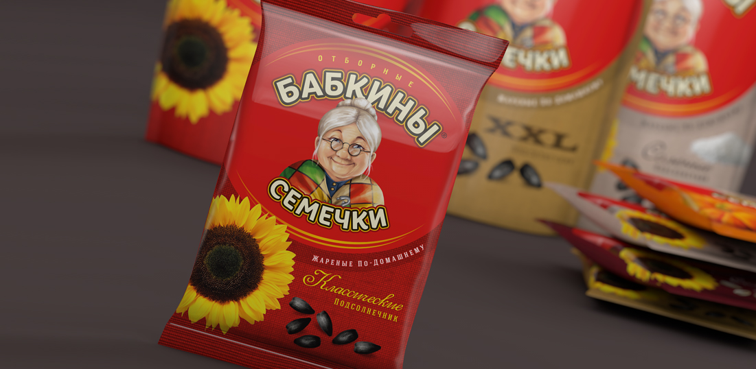
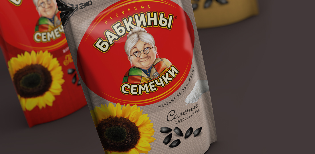
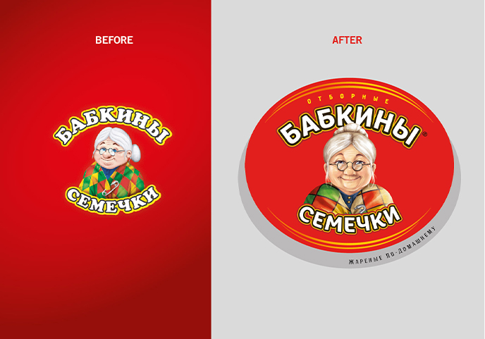
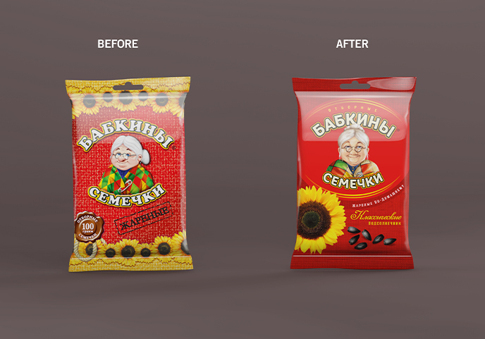
The most obvious change was done on the logo: now it is bigger, has its own background and more modern font types. Above all, the character has been renewed: a more realistic grandmother is facing us and looking straight into our eyes, creating a connection and earning trust.
Under the new logo the caption “fried” changed into “fried like you would at home”, becoming a pay off that adds personality to the brand.
The new system supports the product descriptor with the image of the seeds inside, helping the consumer identify the product at a glance. Even more elements have been retouched, from the texture on the background to the zip on the top, and both are now looking more clean and modern.
Sotto al nuovo logo, la dicitura “fritti” diventa “fritti come a casa”, trasformandosi in un pay off che aggiunge personalità al marchio.
Il nuovo claim system prevede che il descrittore di prodotto sia affiancato dall’illustrazione del fiore/frutto e dei semi contenuti, per semplificare la lettura al consumatore.
Altri elementi sono stati razionalizzati, dalla trama sullo sfondo alla zip sull’apertura, rese anch’esse più leggere e moderne.