Close

Keebler

/ / Sectors / Food / Keebler
 

SCENARIO

T

ince 1853, Keebler has been one of the most iconic and loved biscuit brands in the American market. It targets mainly children, but is also loved by adults who have chosen it since childhood.
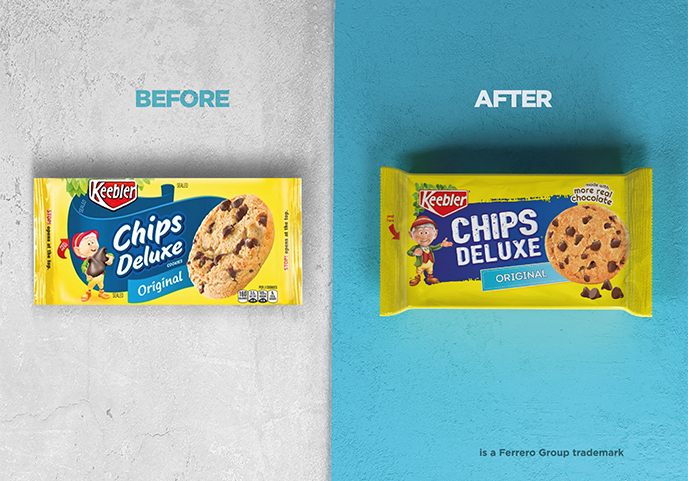
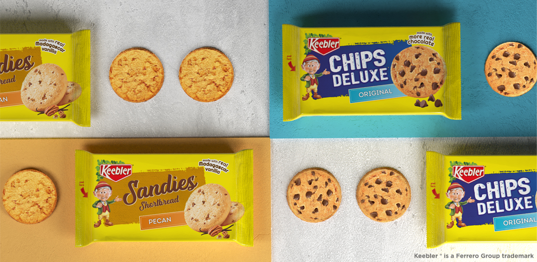
The line is divided into sub-brands that speak with different color codes depending on the degree of indulgence. However, this existing positioning is not perceived as intended by consumers.
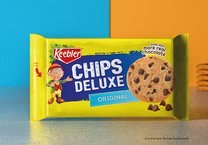
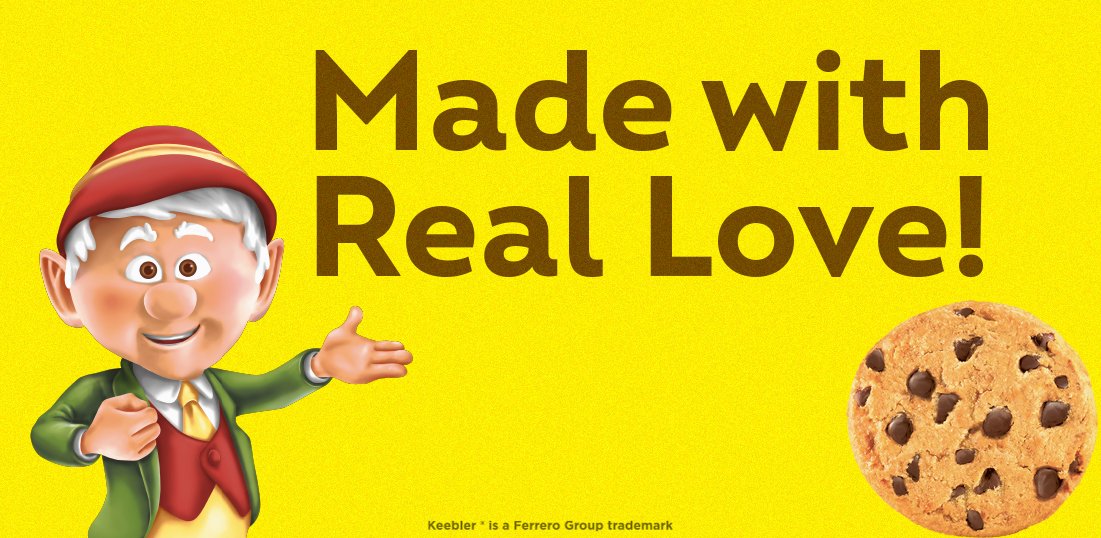
Among the main assets of the brand stand out the Elf-mascot Ernie, one of the most famous characters in American advertising, and the yellow background of the packaging that has always differentiated the products on shelve.

THE TASK

A restyling of the packaging system must ensure consistency within the line, allowing consumers to easily navigate throughout the offer.

DESIGN SOLUTION

Navigation was made easier by rationalizing the layout and assigning a color code to each element: the one in the central area of the pack defines the category (brown-fudge, blue-cookie, beige-shortbread), while that of the tag defines the taste. The sub-brand font is also category-dependent.
At the same time, the emotional aspect was accentuated thanks both to more appetizing shots and a to reinterpretation of “Ernie”, who is now more present and seems to introduce each product and its new identity. The yellow background completes the enhancement of the brand’s assets: more compact, it makes the line even stronger and more iconic on the shelf.

0
Customers: