Close

Shark


Tong before appearing on western markets, energy drinks were widely consumed throughout Asia. In the Far East they are traditionally consumed by people who need a pick-me-up during long working hours, as opposed to the West, where they have always been marketed as something to drink on a fun night out. In Thailand, however, recent trends and changes in lifestyle are opening new marketing opportunities. Shark by Osotspa, the leading brand in the Thai energy drink market (the largest in the world) decided to seize the moment and reposition its brand.
THE TASK

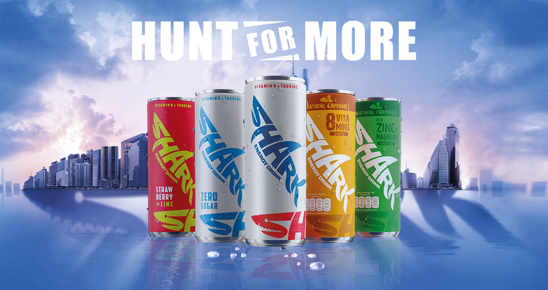
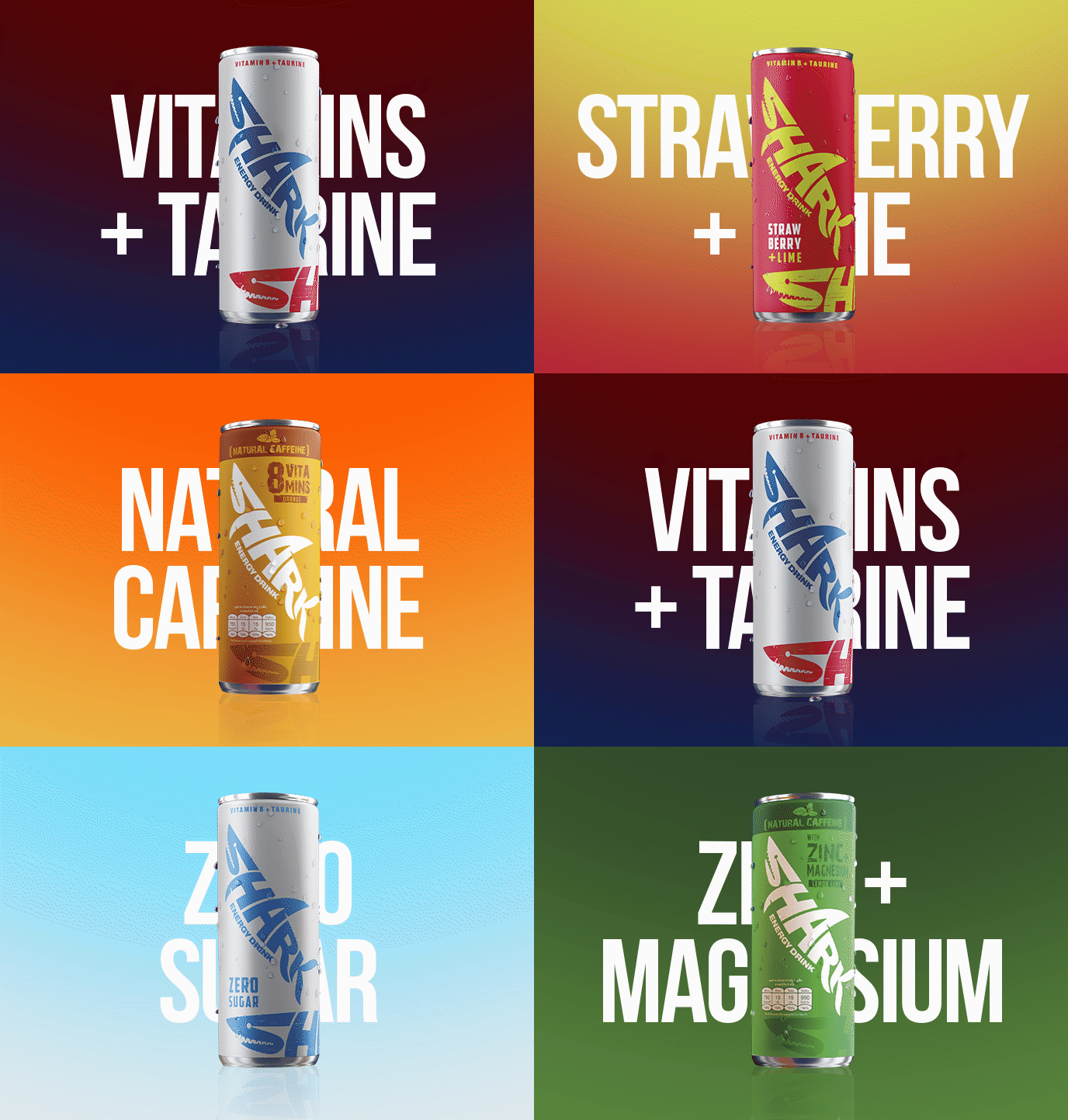
The is to make the product appealing also to carbonated soft drink users, freeing it from a perception that connects it to working performance. Therefore the brand must look more contemporary, trendy and even natural, (emphasizing the presence of natural elements, such as caffeine). All of the above without affecting the high recognisability of a logo that has been on the market for over 30 years. The marketing operation involves a restyling of the brand, the development of 4 new references and a new key visual.

DESIGN SOLUTION

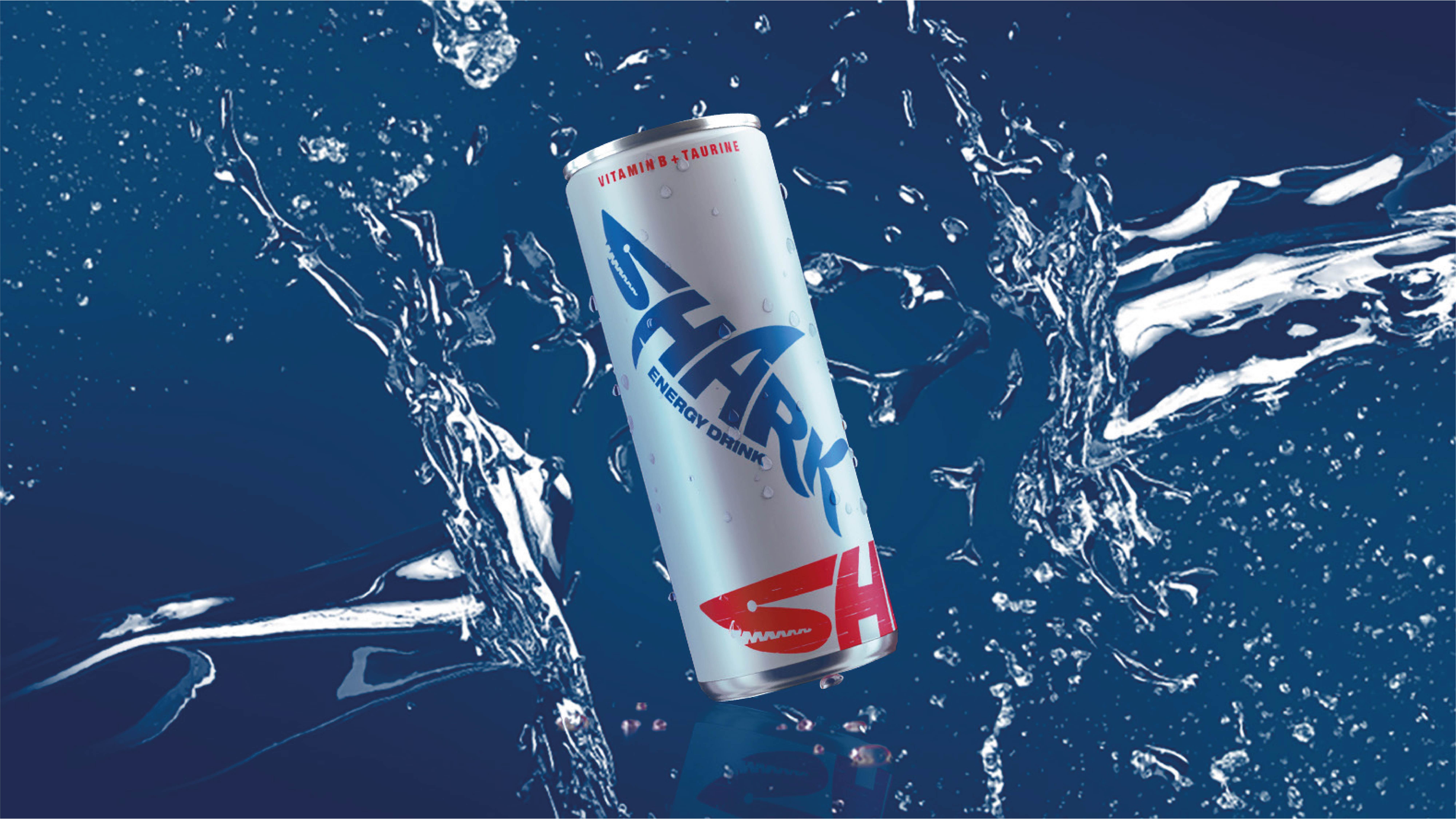
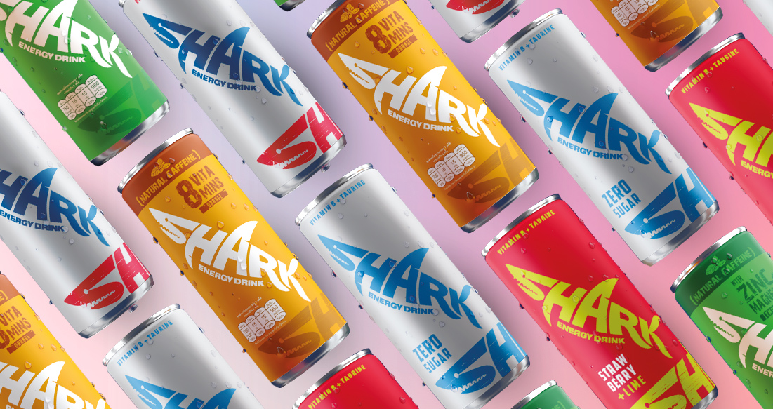
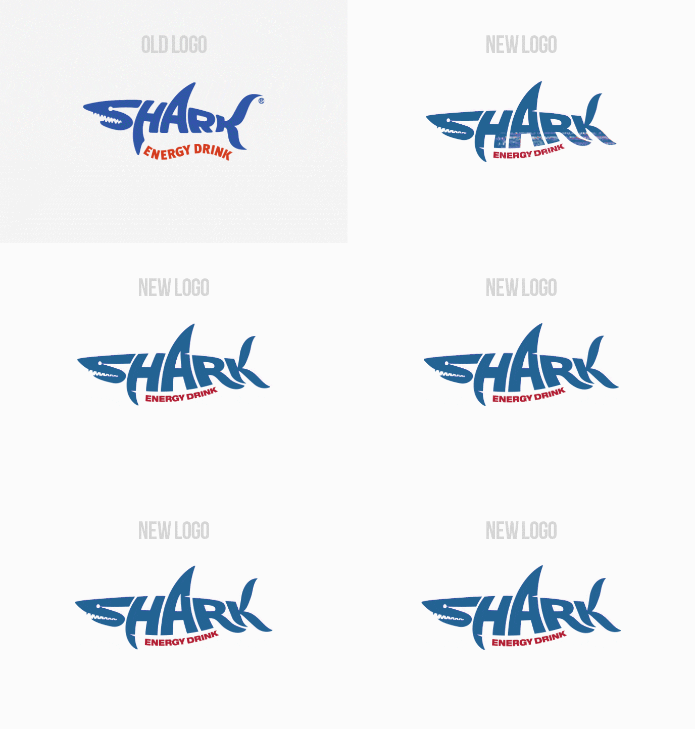
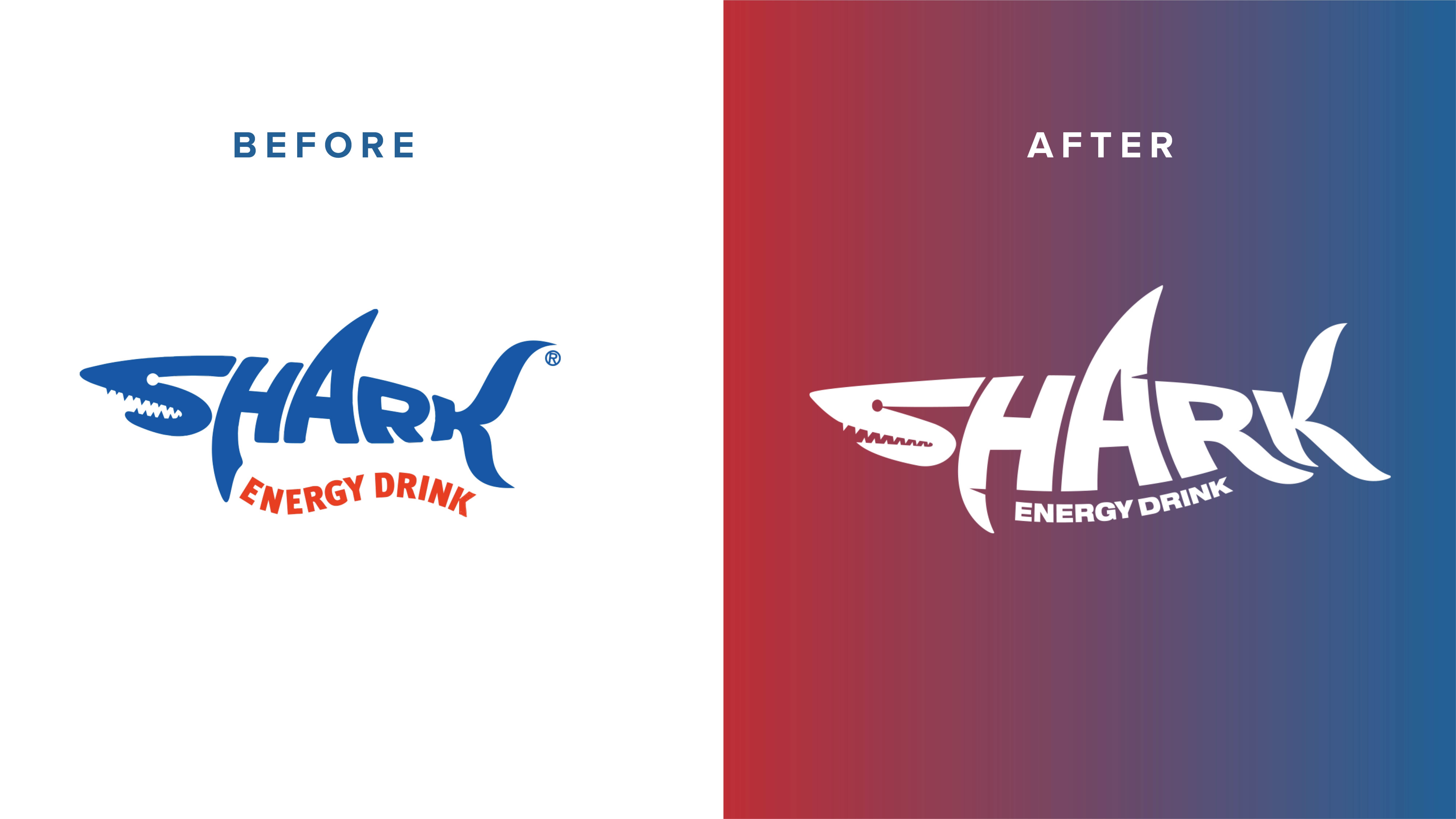
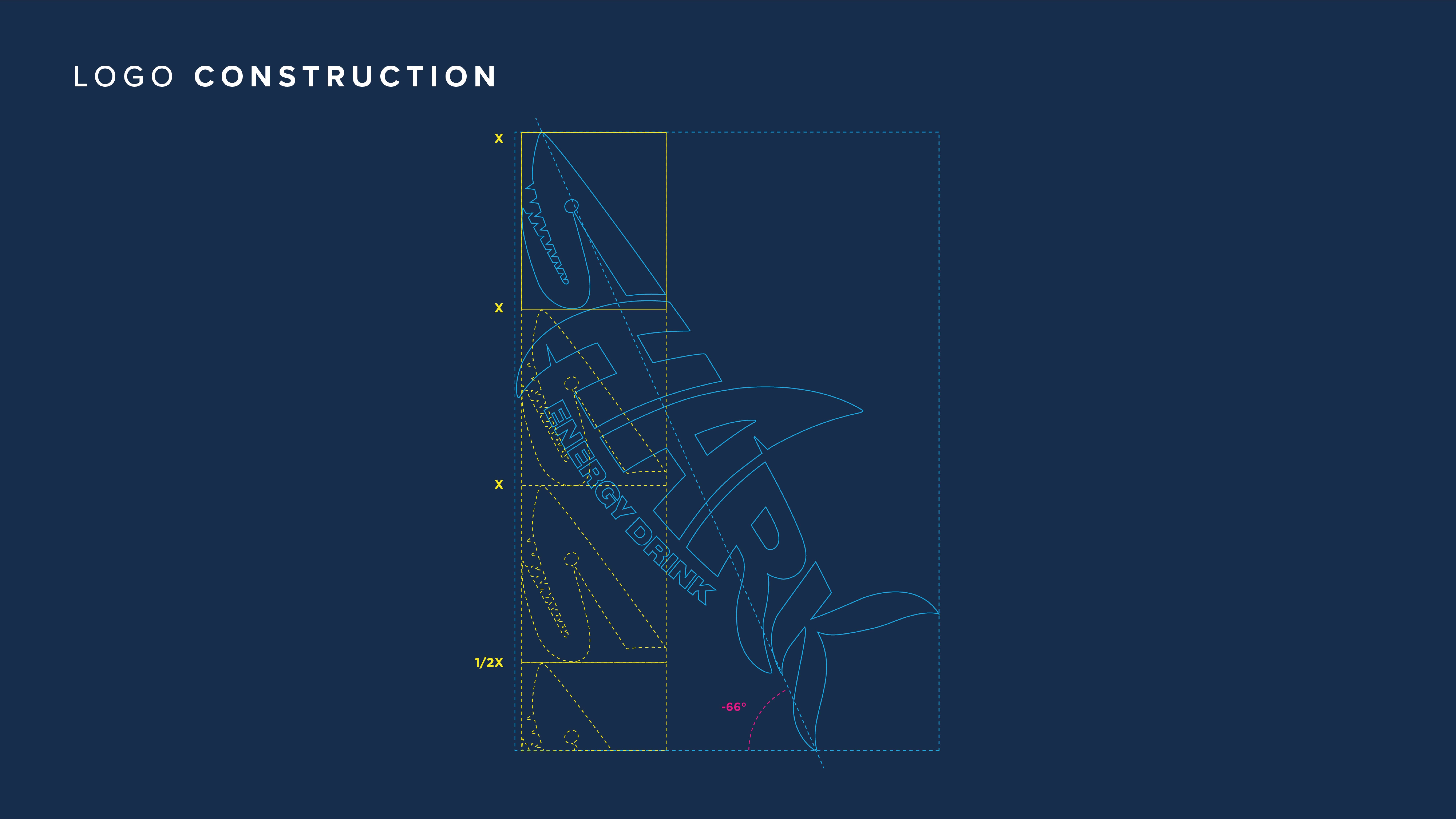
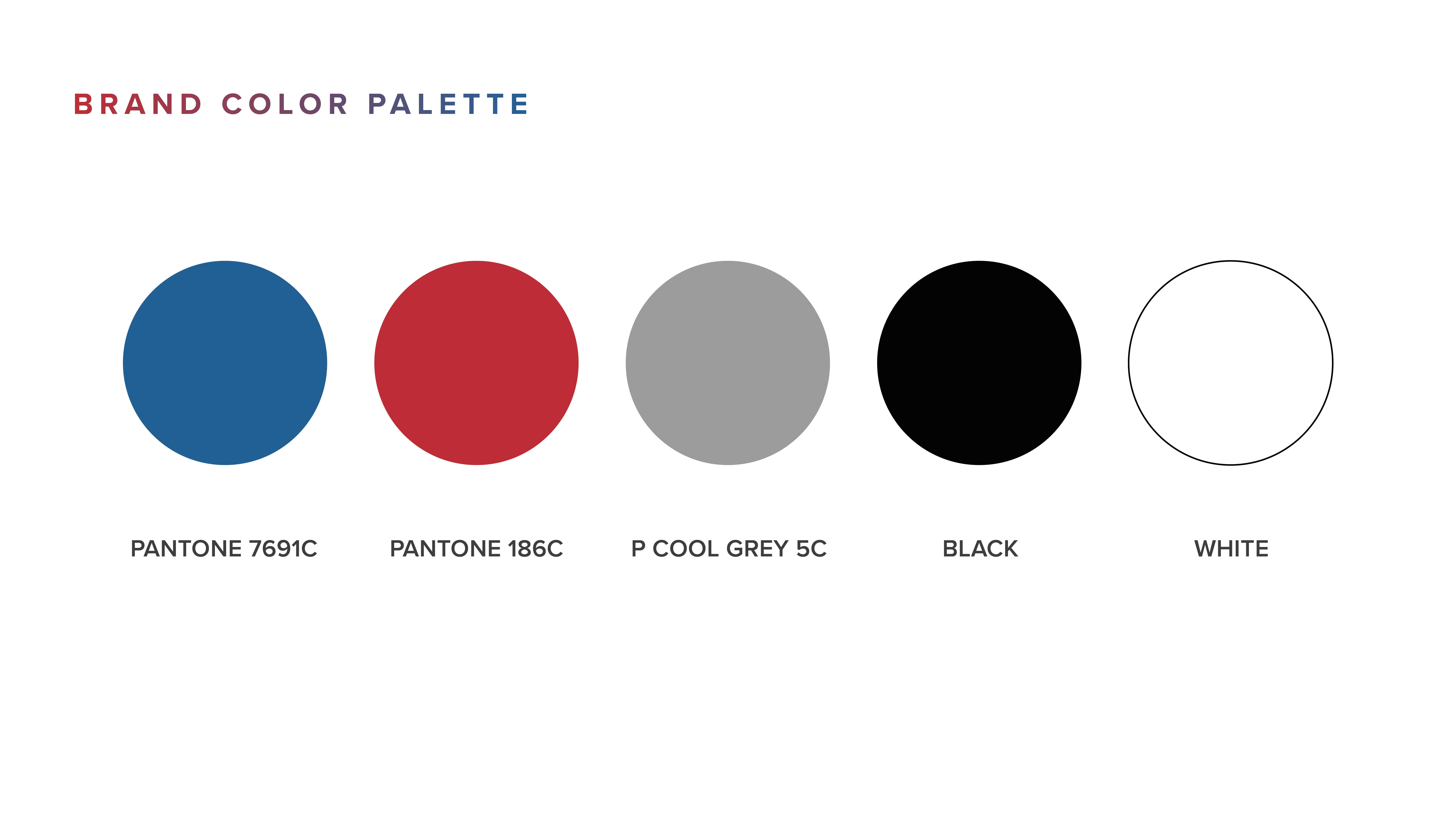
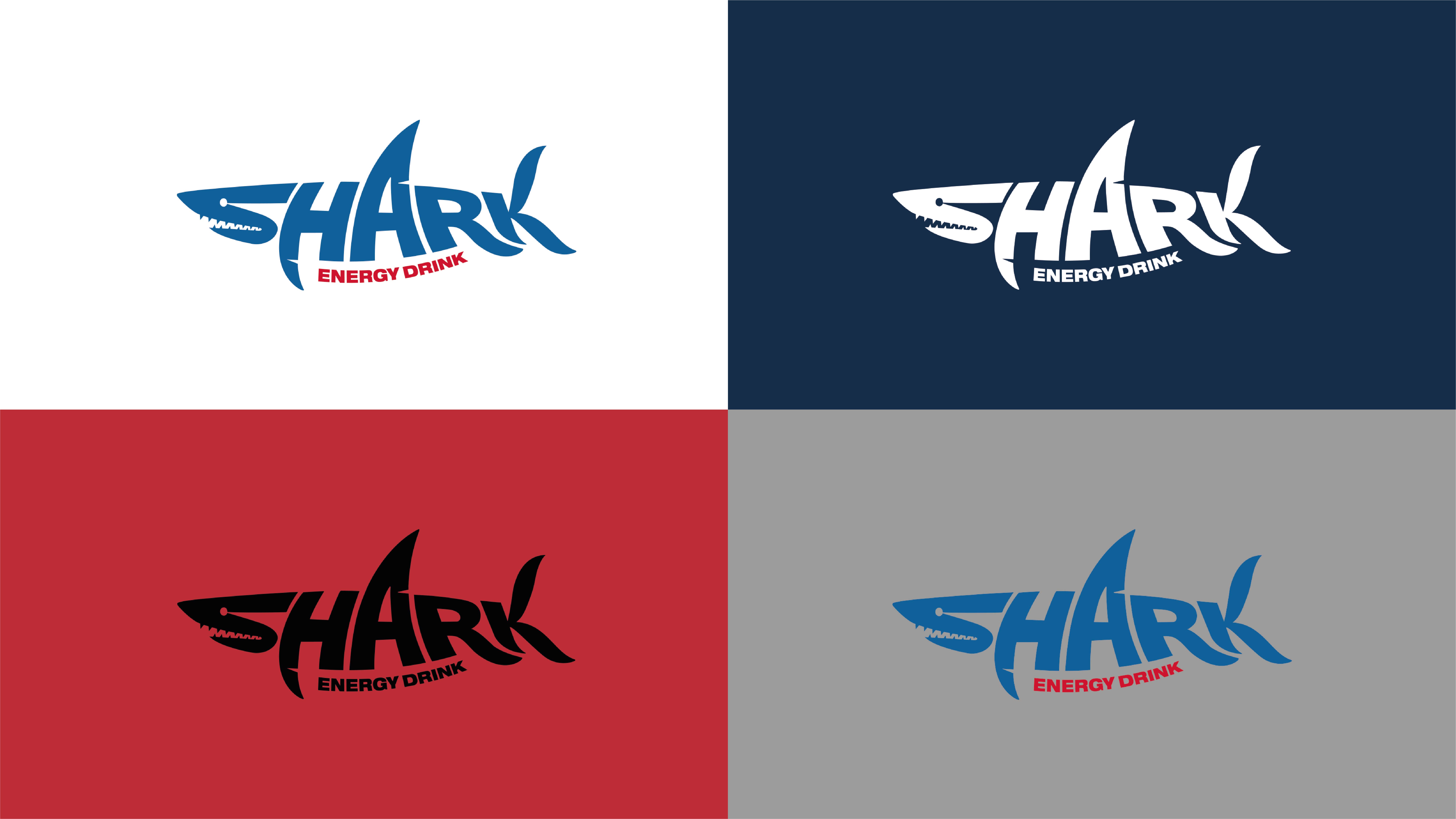
The logo has been made more adult and less playful, thanks to some graphic changes: its shapes are closer to those of a real shark, and the descriptor has been brought next to the logo itself to make the whole look neat and compact. The entire system is now more refined and elegant, while natural caffeine has been communicated on strips of colours related to the main colour of the pack, in order to convey harmony and a natural feel.
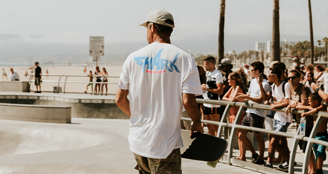
Also the main key visual, supported by the slogan “Hunt for more”, brings the brand closer to the world of trendy urban entertainment, for a more contemporary and quality feel.

0