Founded in 1946 nearby Como, Italy, Artsana is today an international group operating in Baby and Health & Beauty Care sectors. As the company improved the production quality of its Neo Baby brand, it chose to restyle its visual identity. Whilst other baby brands of Artsana are sold in specialized shops, Neo Baby is intended for GDO where the packaging plays a vital role in determining consumers’ choice.
Neo Baby
SCENARIO
THE TASK
It is necessary to reposition the brand in a distinctive way, make it more visible on the shelves and make it look modern and reliable.
DESIGN SOLUTION
After examining direct competitors, we found that the brand could own its unique ground by being friendly, playful, understanding, expert.
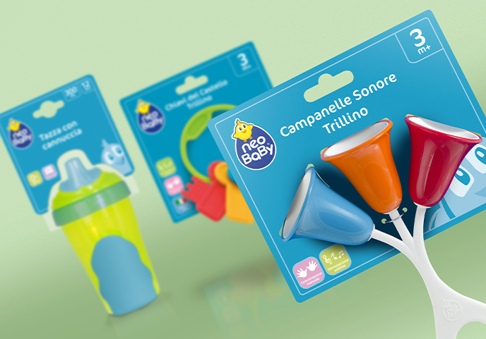
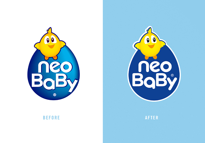
The first step was choosing the main colour for the restyling: the new blue tone is very distinctive and makes the product visible on the shelves while still conveying a feel of reliability.
On the blue background, the cartoon character of the logo has been expanded to add a simple sense of playfulness, along with a very straightforward layout.
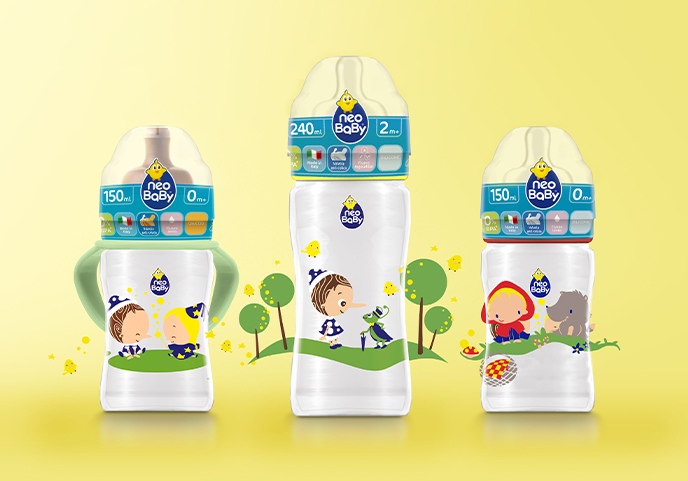
Some joyful icons talk directly to the consumer and convey the expertise of the brand by illustrating the product benefits, the materials used and the Italian-based production. The illustrations on baby bottles have been especially created and are inspired by famous tales to make children happy and state once more the playful attitude of the new positioning.