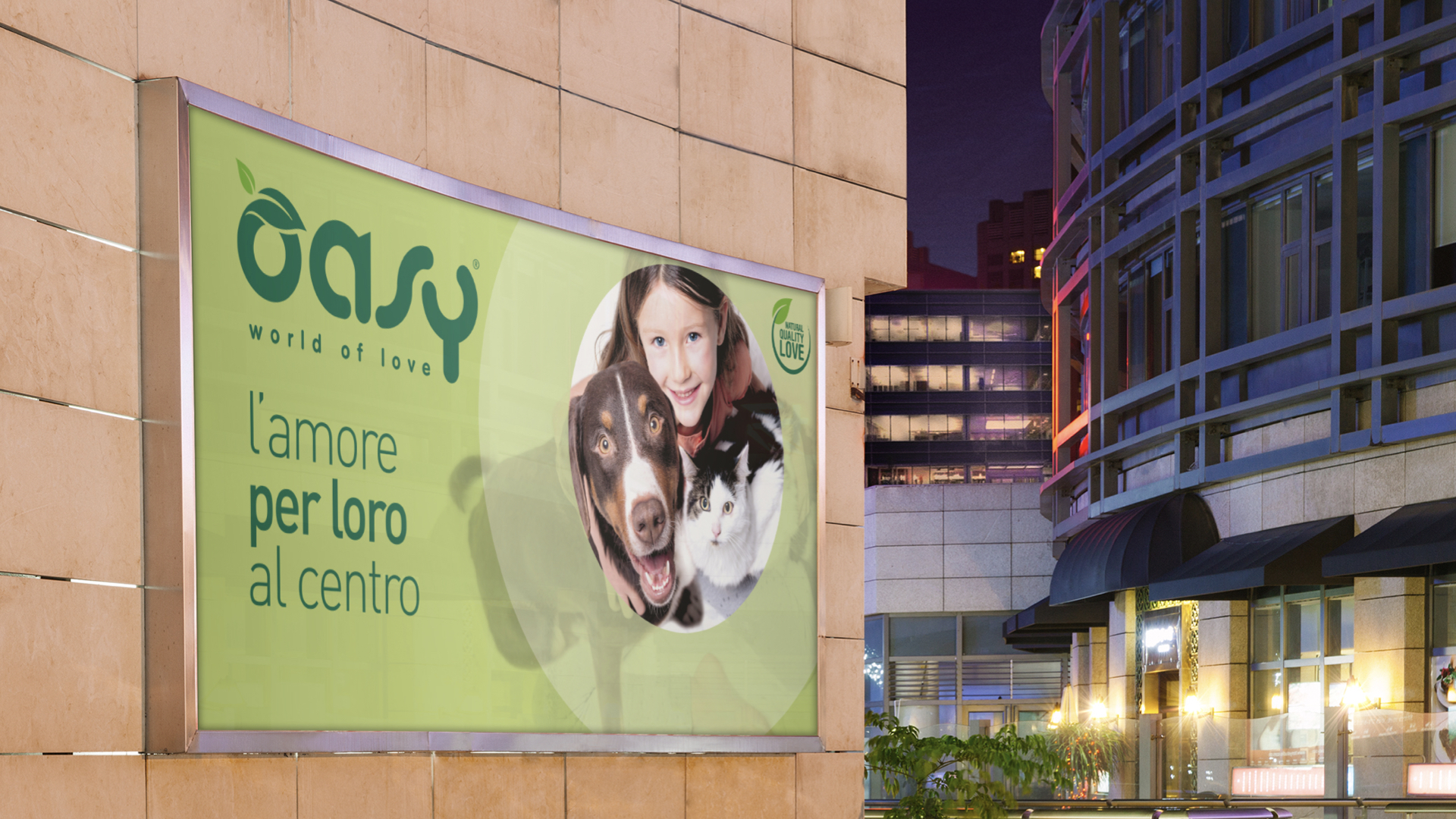
Over recent years, the petfood market has experienced steady growth, due to both the increase in the number of pets and greater attention to the quality of their nutrition. In 2014 Wonderfood turned to Break for the creation of a brand aimed at those who wanted to take care of their pets with quality food. It was necessary to design a brand with its own identity, logo, name and payoff. A brand that would be able to relate to a target of owners who love their pets as part of their family. With a distinctive positioning indeed, Break put the focus on human feelings: the protagonist is no longer the pet, but the love that owners feel for them.
Oasy Pet Food

S
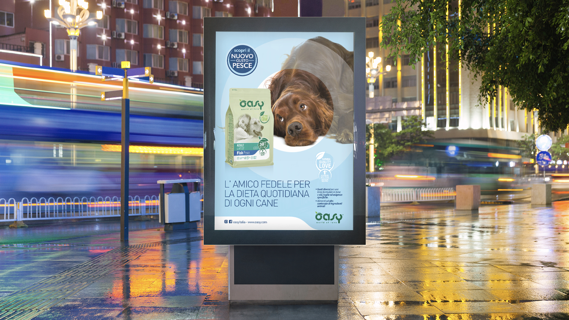
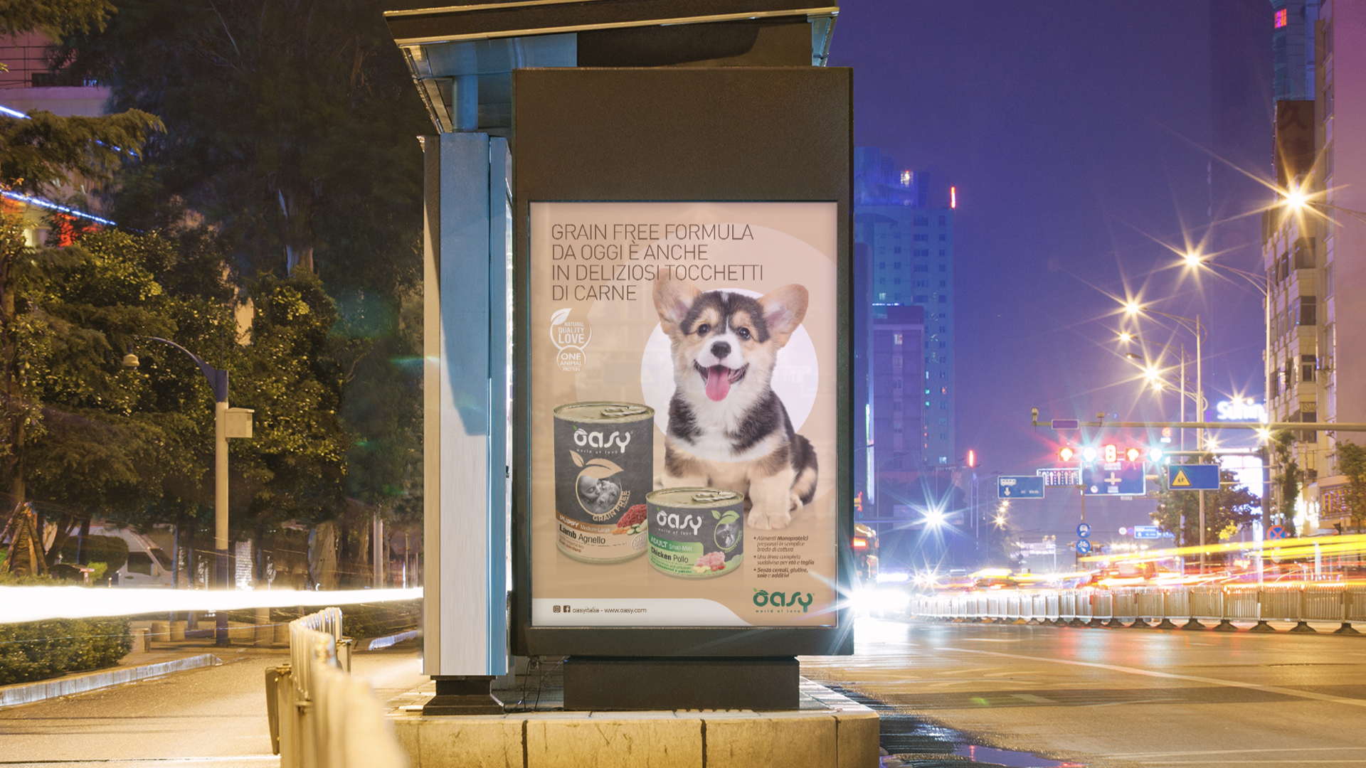
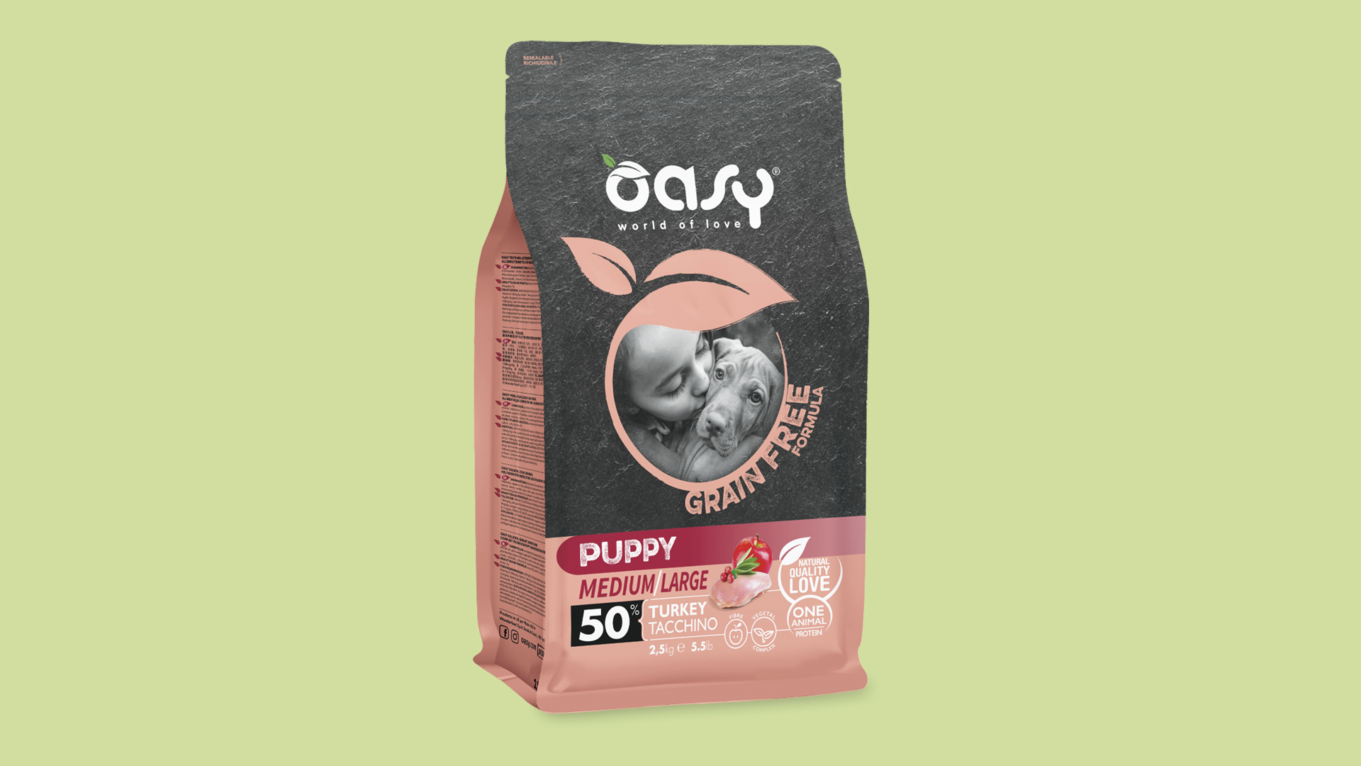
Consistently, the images always show the pet together with a child, in a family context. The name "Oasy" describes a special place, where the most cherished things are protected (the final "Y" personalizes a common word and turns it into a trademark), the logo presents the initial “O” as a closing circle (with a leaf), while the pay off "world of love" tells of a universe of care. Over the years, the brand has grown by differentiating its offering. Break has therefore communicated a wide range of benefits designed for the needs of each animal, capitalizing on the brand's assets: in the Grain Free line, the leaf circle in the Oasy logo has been borrowed to frame the main visual and give value to the highest line of the dry category; in the More Love line - top of the range of the wet category - two children are shown to underline the greater value and richness of the product.
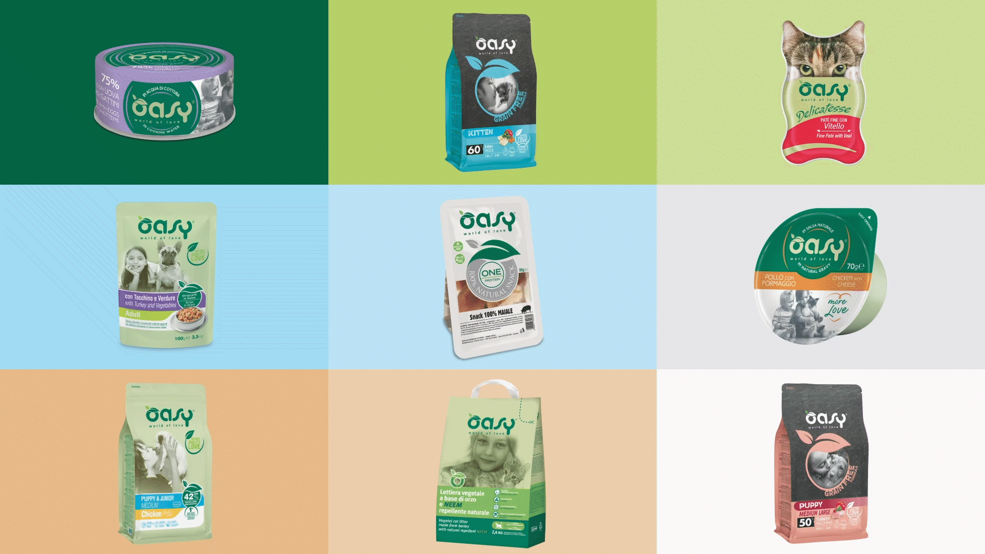
Finally, the communication at the point of sale has been revolutionized: beforehand it was frivolous and playful, now is in line with the positioning of the brand, reinforcing the idea of “focusing on love". The tone of voice, more serious and adult, communicates the premiumness of the brand consistently with its growth both at national and international level.