

Close

ROBERTO – Rediscovering Taste

/ / Sectors / Food / ROBERTO – Rediscovering Taste
 

Roberto is a trusted, down-to-earth brand with an honest character. It stands for the warmth of family, the joy of sharing and the pleasure of simple, good food.

Its story is deeply Italian, rooted in tradition, everyday rituals and moments spent together.
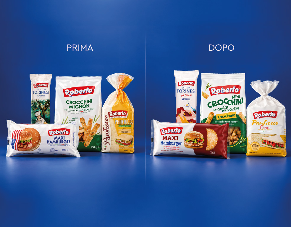
Yet its visual identity no longer fully expressed what the brand stood for. Over time, those values had become less clearly defined.

Our challenge was to bring them back into focus through a fresh, contemporary perspective: evolving the brand’s visual identity to connect with today’s consumers while preserving its distinctive character.

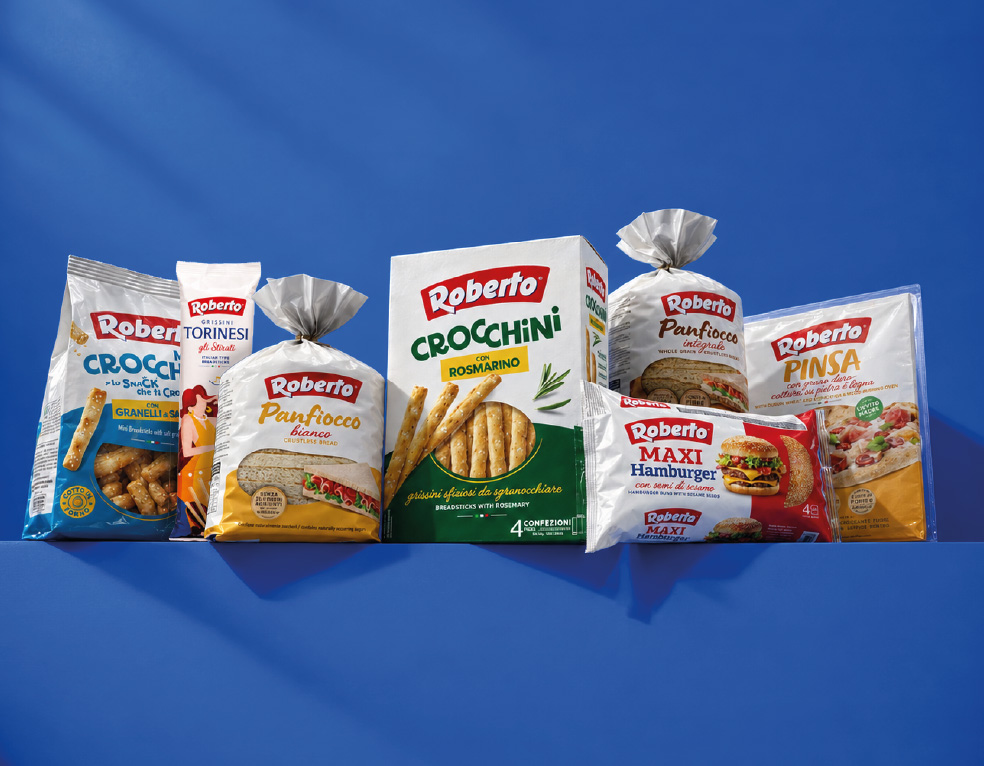
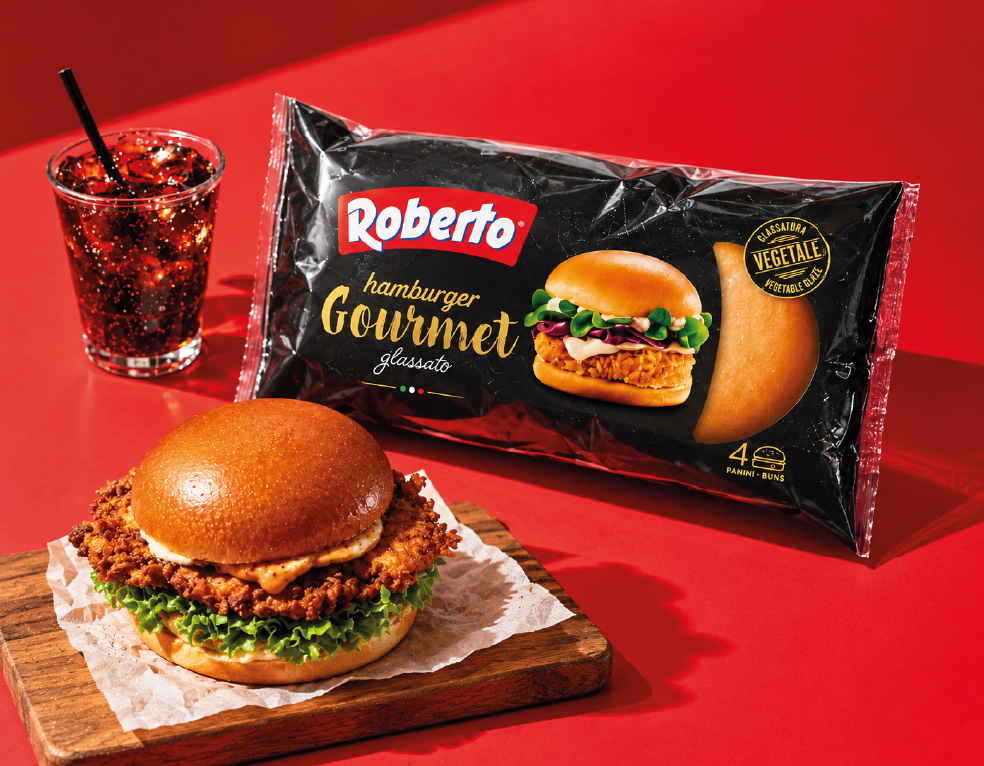
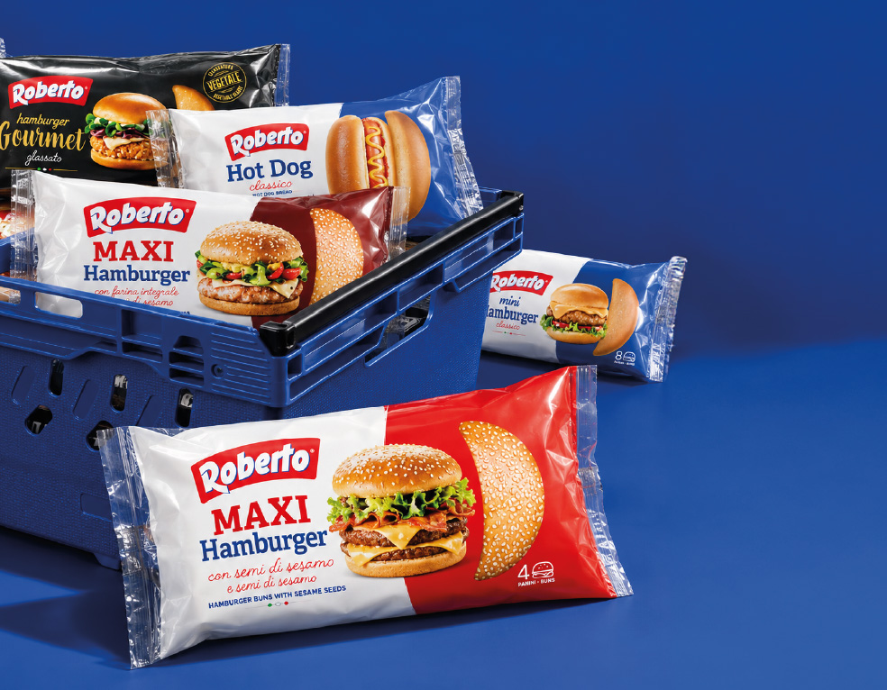
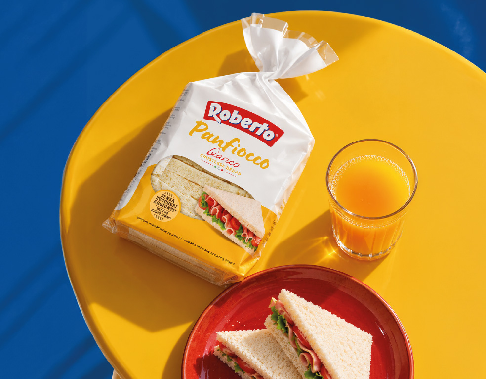
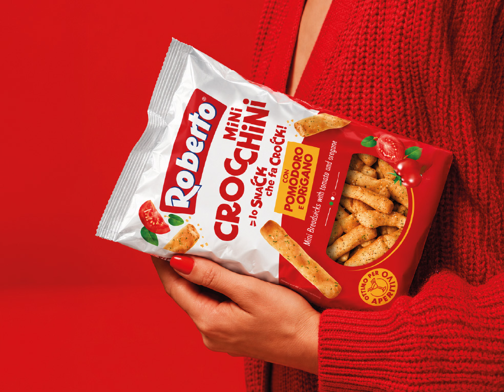
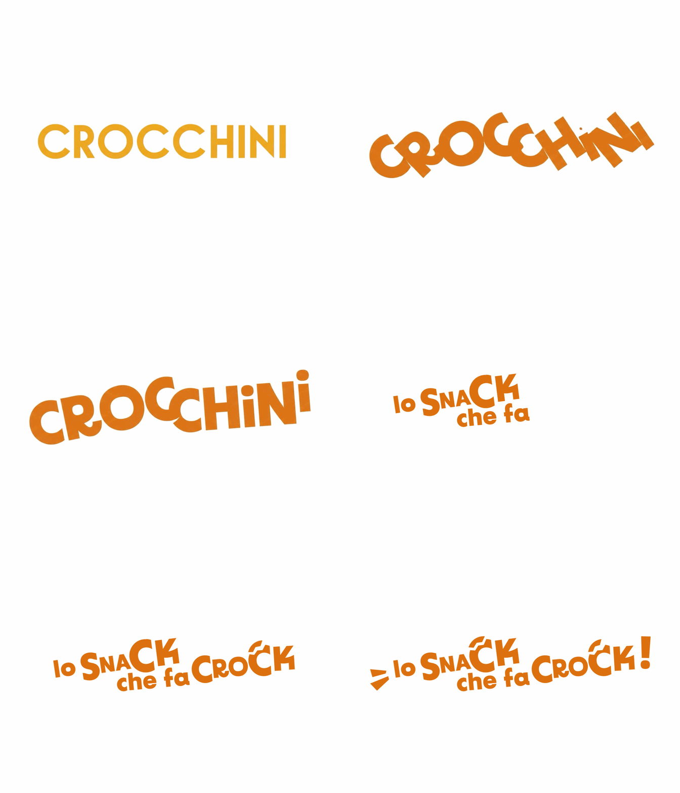
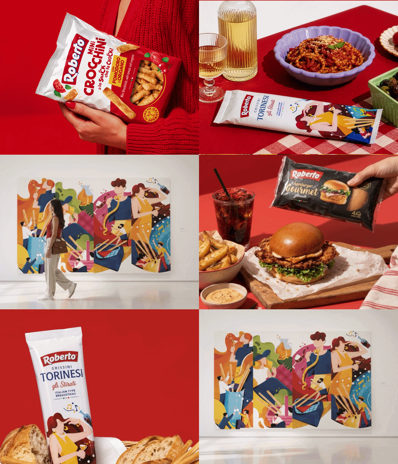
We developed a design that gives each product category its own personality through expressive typography and a strong emphasis on taste. Moving beyond the previous rigid, less distinctive structure, the new direction gives Roberto a more expressive visual language.

The result is packaging that brings renewed energy to the brand, keeping its values recognisable while making the choice of flavours part of the pleasure.

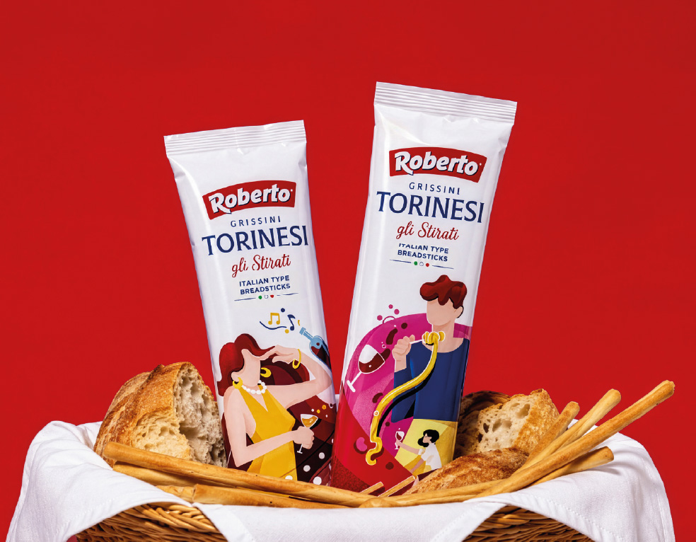
The redesign extended across the entire range, including a classic of Italian food culture: the Torinese breadstick. A familiar presence at Italian tables for generations, it embodies the pleasure of gathering and sharing.

We turned each individual wrapper into a little story, with hand-drawn scenes capturing the many occasions when a simple gesture becomes a moment of togetherness.

0