Break - the simpler, the stronger.
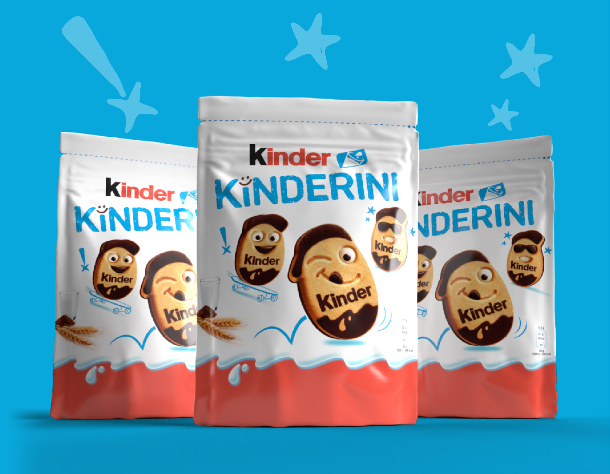
On a frantic, cluttered shelf it takes a brave agency to keep it simple: that’s what Break did for Kinderini, the first shortbread biscuits by Kinder.
Break - the simpler, the stronger.
On a frantic, cluttered shelf it takes a brave agency to keep it simple: that’s what Break did for Kinderini, the first shortbread biscuits by Kinder.
According to Break’s philosophy, creative choices are not made for the sake of aesthetics, but totally driven by the Brand and its iconic primacy.
Kinder stands for the emotional bondage between adult and child, and its credibility relies on an extremely consistent image, to be reinforced time after time by respectful executions.
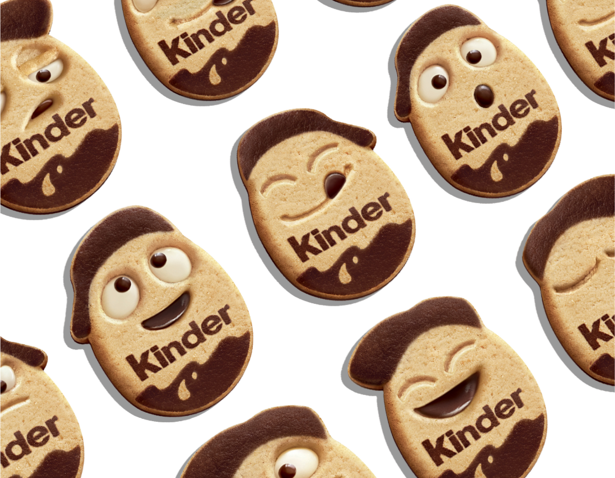
Our creative idea starts from the naïve imagery of childhood to tell the Kinderini story: such a simple biscuit comes after years of careful studies on that special “Kinder taste” our kids love, with a hint of chocolate and that playful emotion…
Graphic traits evoke children's first drawings, and the style comes from crayons: such features bring the biscuits to life on pack, leveraging on children’s fantasy to start up a thousand stories in their mind.
A joyful yet reassuring logo - just like Kinder - able to surprise without exceeding, never yelling.
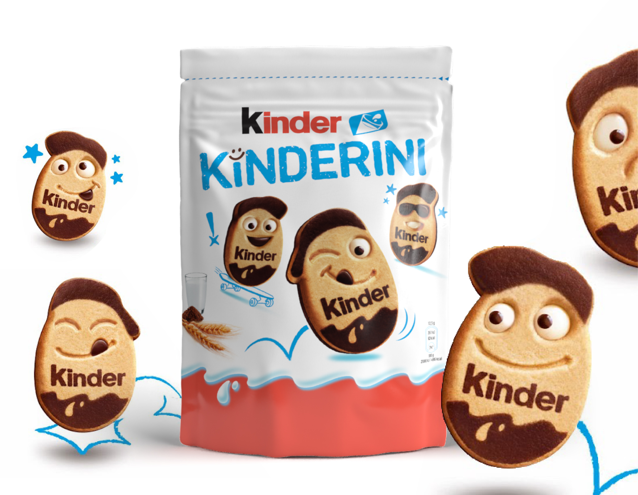
Both the shopper (adult) and the target (child) are conquered by an image that fills the family breakfast with magic.
Up to 18 different facial expressions of the biscuits have been developed to stimulate our target’s interaction.