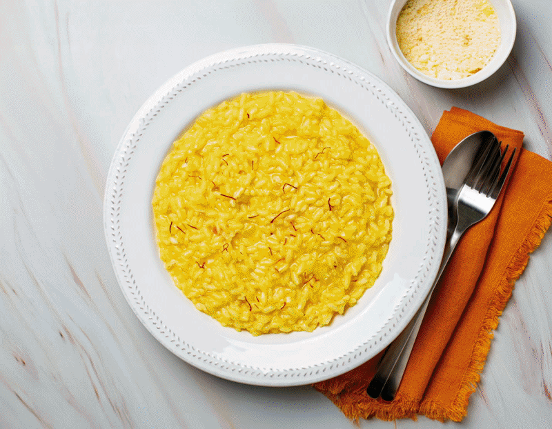
Since 1856, Riso Gallo has found a place in the hearts and homes of all Italians. Not only because of its 170-year history or its iconic advertising featuring the rooster mascot and the brilliant ‘Chicchiricchi’ slogan, but because of what it has truly been able to offer consumers: the widest range on the market, comprising high-quality, sustainable products, creative recipes and constant innovation.
This expansion of the range has, over time, led to a dilution of the brand identity, which has become fragmented across different products.
How can a brand regain a unified identity by telling its DNA, history and origins, while preserving the specific qualities developed by each product?
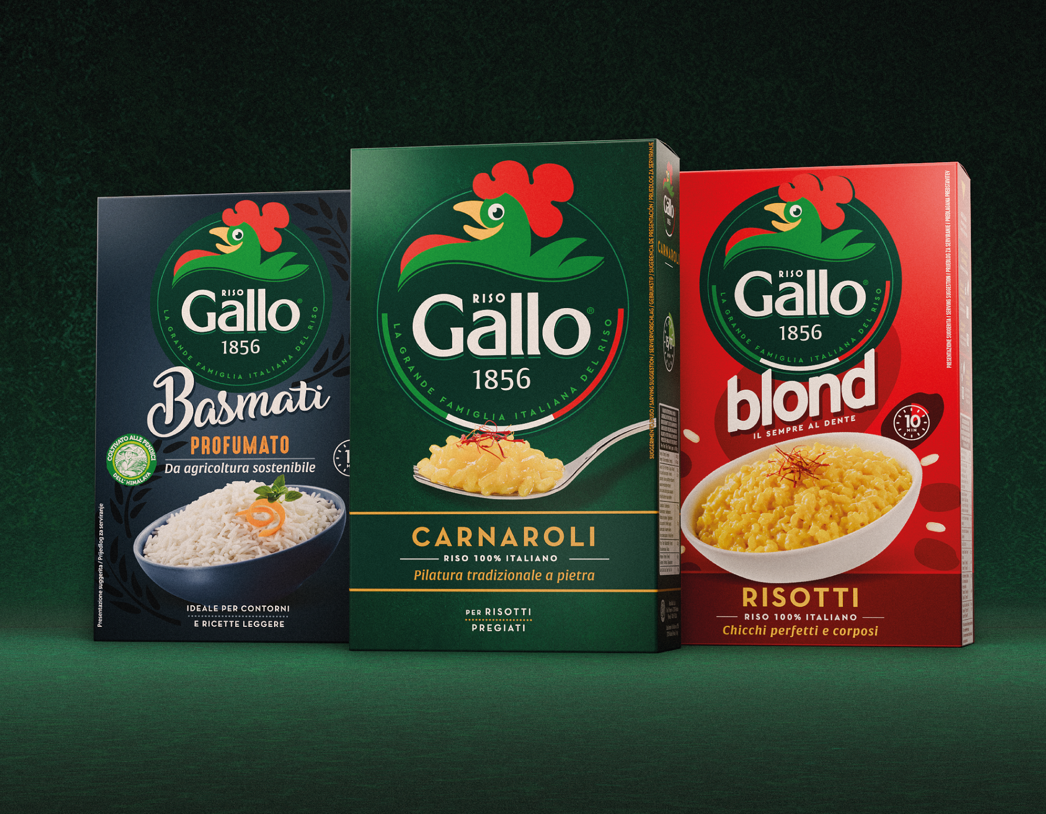
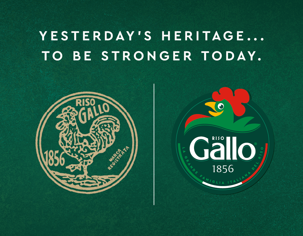
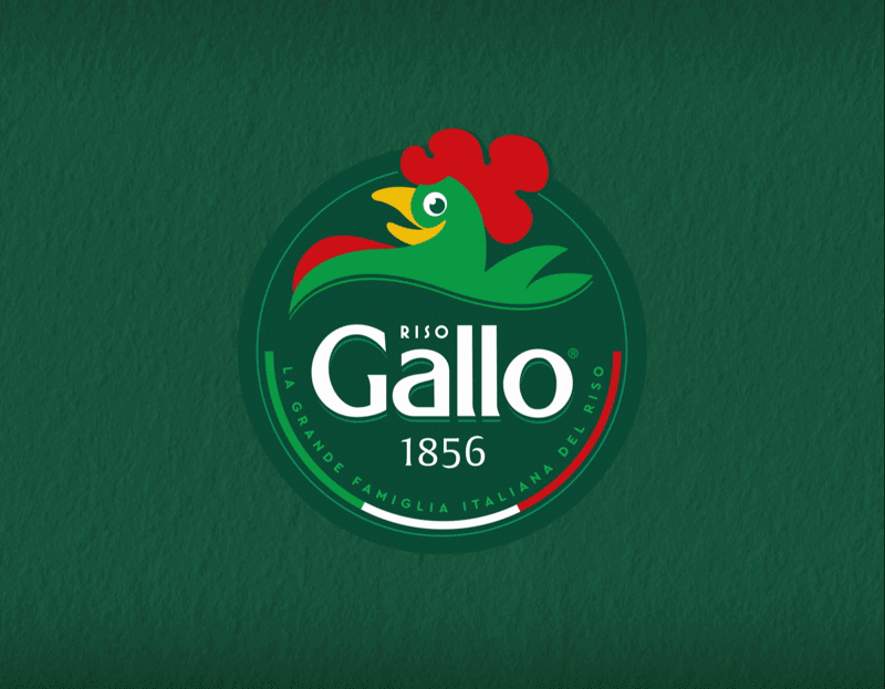
Break embraced this delicate challenge by starting with the logo, the first and most fundamental element of the rebranding process. The brand’s core symbol, the rooster, was placed at the center of a new circular seal, inspired by the original 1856 mark. Just like at the beginning, the historic date and the word “Riso” return to the spotlight.
Completing the brand identity is its Italian spirit, emphasized through a tricolour semicircle and the payoff “LA GRANDE FAMIGLIA ITALIANA DEL RISO.”
The new logo thus becomes the cornerstone of the brand identity, around which the entire product range revolves. The revision of existing categories follows a continuity-driven approach, enriched with typography and imagery that convey premium quality, dynamism and modernity.