Segafredo is an historical brand that boasts great recognition both in Italy and abroad, and one of the largest coffee producers in the world. In Italy, however the company has not communicated for a very long time and the brand partly lost its identity. Even its best selling line is often sold through promotions and its benefit is mostly functional rather than emotional.
Segafredo
THE TASK
Segafredo needs a new, strong identity, enabling consumers to relate to the brand again rather than just to its products. The new positioning will have to leverage the company’s superior experience in selecting and roasting coffee.

DESIGN SOLUTION
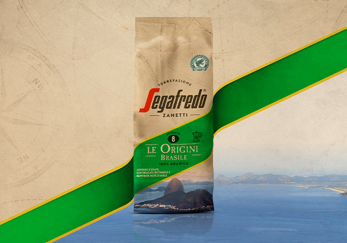
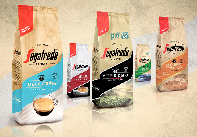
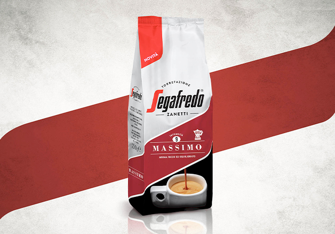
The first intervention was done on the logo: it now looks more linear, it stresses the word “Torrefazione” (roasting) and gives more legitimacy to the “Zanetti” signature in order to emphasize the experience and expertise of the company.
The new pack recalls the bag once used in roasting shops, and each line communicates also through tactile sensations, ranging from the “glossy” patina of “Supremo” to the rougher one of “Le Origini” – to give back a raw feel. Finally, the new system hinges on a slightly wavy band (inspired by the “S” of the logo). Inside it, an icon indicates how to use coffee and an accurate flavour descriptor encourages consumers to deepen their culture of coffee.