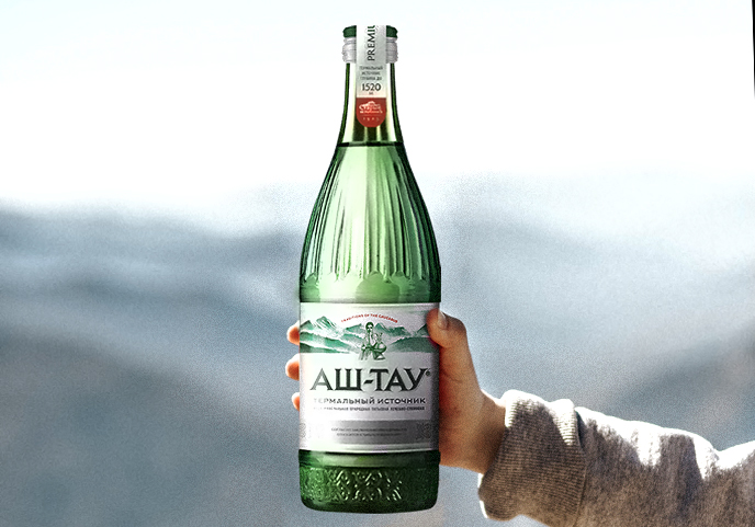
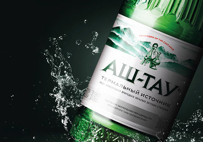
Close

Ash Tau

/ / Sectors / Beverage / Ash Tau
 

Aocated in a region of the Caucasus renowned for the purity of its glaciers and the properties of its water, Stariy Istochnik (Old Spring Company) is a major player in the mineral water market of southern Russia. Its products are exported to more than 40 countries.

One of them is Ash-Tau, a water that owes its unique health properties to the geological conditions in which it springs.

Break was asked to revise the visual identity of the brand, acting both on the design of the bottle and the label. Not a revolution but an evolution, repositioning the product in the premium segment of the market. The new design must feel unique and contemporary while effectively communicating the USPs of the product.

The new bottle recalls yet simplifies the shape of the previous one, adding decorations that recall the hilt of a Caucasian sword in order to underline the unique origin of this water. The illustration of a woman on the label (referring to a local legend) has the same intent and contextualizes an otherwise generic and overused element such as mountains. Consistently, the new pay off reads: “Traditional Caucasian."

The logo has been made more premium while maintaining a strong recognizability. The company logo, on the other hand, has been moved up and, in general, the entire hierarchy of information has been streamlined. The new colors (aqua green) are in line with those of the reference category.

0